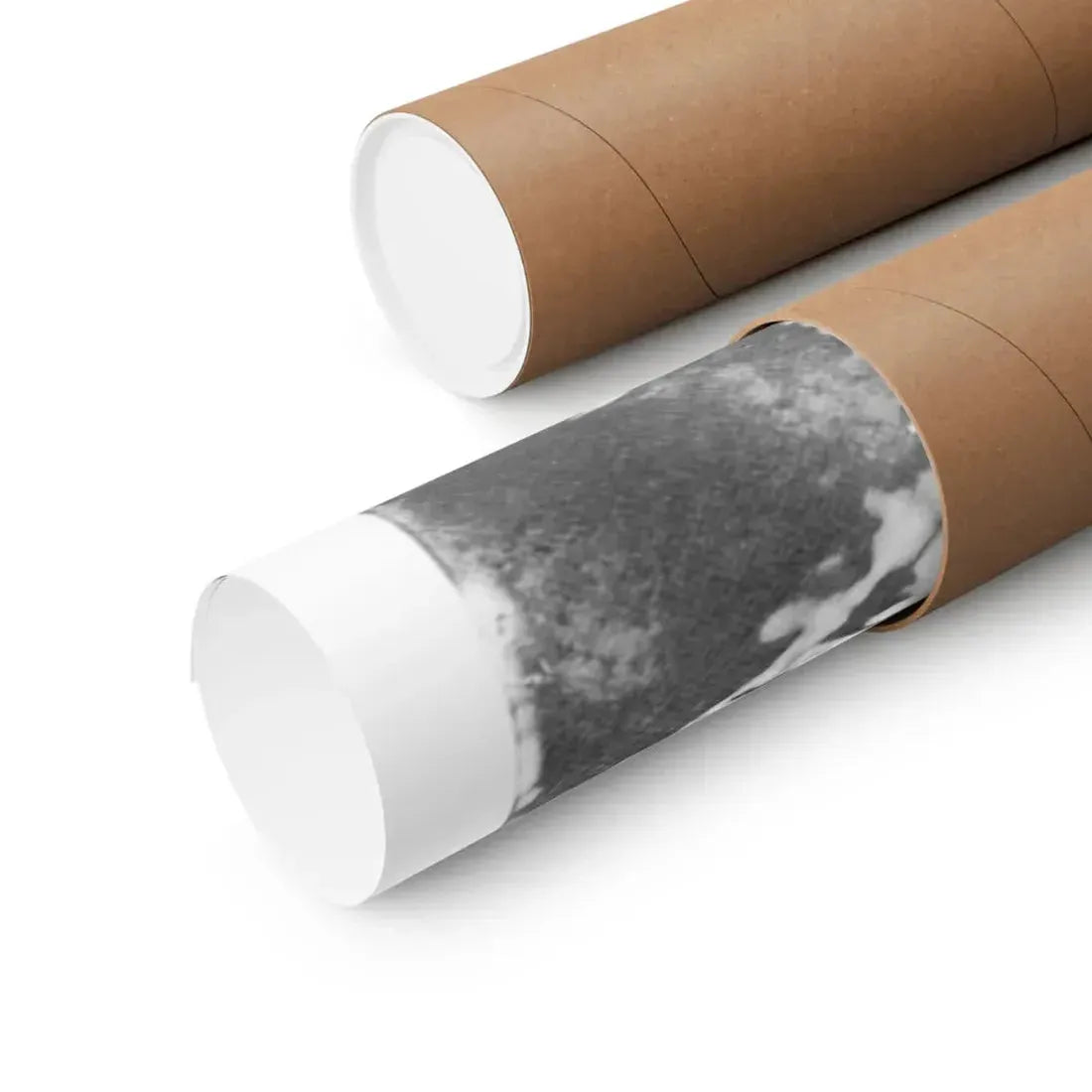


Premium matte paper posters printed on museum-grade archival stock (175 g/m²). Designed for indoor display, these prints deliver precise color, fine detail and long-term stability — allow a small production tolerance of ±1/16".
These posters are printed on archival museum-grade paper that feels substantial in the hand and holds ink very well. At 175 g/m² the sheet is heavy enough to lie flat in a frame but still easy to handle when framing or mounting.
We print with pigmented, archival inks that emphasize tonal range and protect against quick fading. The matte surface soaks up light rather than reflecting it, which helps textures and subtle color shifts read naturally under indoor lighting.
- Paper: museum-grade archival matte, 175 g/m² — sturdy, low-reflection surface for artwork fidelity.
- Inks: pigmented archival inks for accurate, long-lasting color reproduction.
- Finish: matte — reduces glare and keeps detail visible under common indoor lights.
- Use: intended for indoor display only; avoid prolonged direct sunlight and damp areas.
- Tolerance: small production variance (typically ±1/16") is normal; framers account for this routinely.
These posters work well in living rooms, bedrooms, studies and office spaces — anywhere you want printed art that reads clearly without distracting reflections. The matte surface is especially useful beneath spotlights or ceiling fixtures.
- Pick a spot: choose a wall away from long periods of direct sun and high humidity to keep pigments stable.
- Frame or mount: the paper’s weight pairs nicely with common frames and matting; if using a mat, leave a small gap to account for the ±1/16" tolerance.
- Arrangement tip: for groupings, place larger pieces at eye level and allow 4–6" between frames to avoid visual clutter.
Practical note: if you plan to float the print in a frame, check the frame rabbet size against the print dimensions and allow for the small manufacturing variance.
Keep prints looking fresh with light, occasional care. Dust with a soft, dry microfiber cloth. If a mark needs attention, dab very lightly with a barely damp cloth and dry immediately — do not rub hard.
Avoid ammonia-based cleaners and abrasive pads; they can harm paper and inks. For long-term preservation, consider framing behind glass or acrylic and keeping the piece out of humid rooms.
Posters are offered in multiple standard sizes. Listed dimensions refer to the print area (width × height). Because of the production and cutting process, expect a small variance — typically within ±1/16".
If matching multiple prints or ordering custom framing, measure the final framed dimensions and allow a small margin for this manufacturing tolerance to ensure a good fit.


